4 Mistakes You Are Making Which Cost You Customers
 We all do it – make silly mistakes over and over again which turn off our customers and which get people to walk away and forget about shopping with us. However, there’s absolutely no reason why we should make these mistakes except perhaps that we don’t realize that we’re making them. So, based on my research, here are four of the most common mistakes online marketers make which costs them customers:
Being a Clone
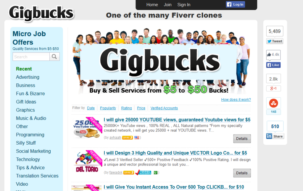
There’s an old saying – imitation is the sincerest form of flattery. Now while it’s true that you can learn a great deal from some of the great websites out there such as Amazon.com or Fiverr, it’s important to also do something to make your own website into something which looks unique and which has something to offer other than just a copy of the big boys.
So why exactly is this a problem though? After all, if it’s good enough for someone like Amazon or eBay or Fiverr then surely it must work and that means that if I copy them, I’ll be able to make lots of money too, right? In fact, there are companies that use exactly this idea. I can’t tell you how many clones of Fiverr I’ve seen for example.

These guys literally copies Fiverr word for word and have the exact same design, often with the same colors and the same design. Sometimes, they’ll change it up only in the amount of money they charge – some are $10, some $20. Of course, there are the Fiverr clones which simply work exactly the same way, right down to charging five bucks for a gig.
The problem of course is that everyone knows who Fiverr is. They know that Fiverr is likely to have the services that they need because well, it’s Fiverr. So why the heck are they going to look at your me too website and try to find a gig with the handful of people desperate enough to advertise on your much less trafficked site?
Moreover, Fiverr has built up their business over time to the point where they know that they can count on a certain number of people simply typing in their domain name and going to look for what they need without the need to do SEO or other kinds of advertising. In short, you are not Fiverr and you likely don’t have the budget to create a clone which gets as popular as they are.
Instead, consider creating your own unique draw for your website and allow people to see that you have something unique to offer. It may be as simple as offering different pricing structures (i.e. $10, $20, etc.) though that’s been done to death as well. Instead, maybe consider doing something where you vet people who want to advertise on your site and you guarantee that the people doing the work know what they’re doing and won’t screw up.
I know that I’d gladly pay extra for that kind of a service, especially if I was given some kind of a guarantee that there will be someone to intervene if there’s a problem later on. I can’t tell you how many times I’ve bought a gig on Fiverr only to be disappointed with the results.
Mind you, I know that when people earn just $4 for a gig they can’t spend much time doing it but even so, I’d rather pay extra and know that I’m getting what I need rather than pay a cheap price and find that it’s a crap shoot. Worse, when I find someone good, inevitably they’re going to leave Fiverr pretty soon because they can make more elsewhere.
Confusing the Heck Out of Your Visitors
Okay, now that I just got through telling you about how you shouldn’t just imitate the greats, I’m going to reverse myself and tell you that in some cases, you should imitate them. At least insofar as how to design a website which is easy to use.
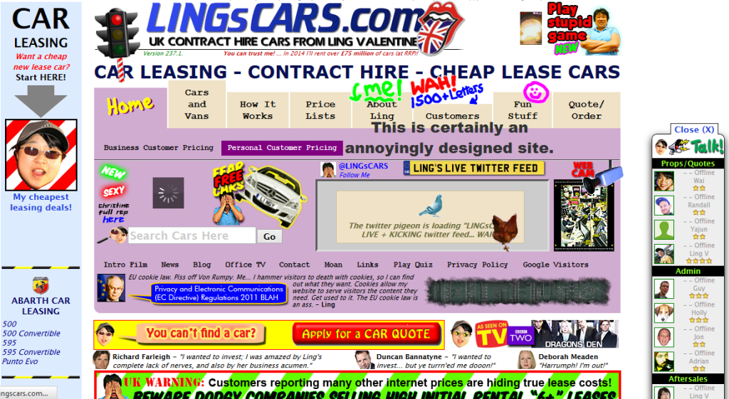
If you think that having about a million different ads everywhere and having all kinds of different forms of navigation is a good thing because it makes your site unique, you are sorely mistaken. I wrote about this once before when I mentioned The Jerusalem Post as a prime example of a website with terrible design and navigation, mostly because it has so many different ads, not to mention an obnoxious auto-refresh feature.

Of course, they aren’t the only ones engaged in poor design. Unfortunately, there are lots of well meaning webmasters who never seem to have figured out that they need to keep things clean and simple. You want a website which is easy and intuitive to navigate. That means the cutesy menus which seem to pop up out of nowhere are not the kind of thing you want to use.
Basically, a drop down menu like most websites use today is a good thing and something that will keep your visitors happy and content as they visit your site and make purchases from it. In other words, follow the KISS principle – Keep It Simple Stupid. If you do that, you won’t drive your customers crazy and they’ll agree to stick around longer.
Refusing to Accept PayPal Payments
Listen, I know that PayPal is nothing great. I wrote a while back about why PayPal was nothing to write home about and I know that there are a number of Internet marketers who have had all manner of trouble with taking PayPal payments. I’ve heard all the horror stories about accounts being frozen for months with hundreds of thousands of dollars in them and about the byzantine way that PayPal sometimes treats people.
I have only one thing to say: get over it and find a way to accept PayPal anyway. If you can’t accept it yourself because of a problem you had with them in the past, use one of the many payment processor services such as Plimus which do accept them. Bottom line is that you will ultimately find that you are able to get that many more customers if you accept PayPal in one way or another.

Of course, it also helps if you have some other alternative service which you can use to accept credit cards because not everyone can or wants to use PayPal to make their payments. Bottom line, offer PayPal and offer some kind of alternative as well because your customers will not be happy if you don’t have both options available.
Crazy Forms
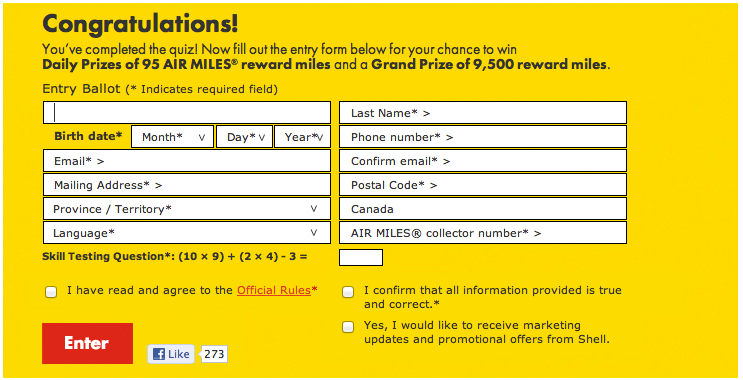
This is something else I’ve written about in the past but it’s worth mentioning again. Make your forms standardized and easy to use. Please. Your customers will thank you for it. People get annoyed as heck when forms aren’t designed to be easy to use. This includes building forms which are intuitive to fill in and which aren’t hard to read.
I’ve also seen an awful lot of different forms which are designed to reset themselves if you make a wrong move. I cannot tell you how incredibly annoying that is! If you create a form which forces people to start over again if they make a mistake, I can guarantee that an awful lot of your customers will disappear.

Also, don’t make people crazy about passwords. On the one hand, you do want to ensure that your customers pick passwords which are protected and which cannot easily be broken. On the other hand, if all they’re doing is registering for your blog in order to leave a comment, they don’t need to pick a 25 character random password in order to sign up. Simple, basic passwords will do for such things.
Oh and again, if someone picks a password which your system doesn’t like, let them know automatically rather than making them hit submit and then wonder why they’re back at the basic form. Never mind the insane forms which actually have people filling everything out over again when they pick a bad password.
One more thought regarding forms. I know that a lot of you now employ captchas to try to cut down on the robots which seem to proliferate throughout the web. Of course, you probably also know that captchas are now pretty easy to get around using any number of different services which are designed to automatically get past them.
However, one of the worst ideas that you could possibly engage in is to make people crazy filling out the whole form over again because they didn’t fill in the captcha correctly. Oh and offer an option to have the captcha read out to people and to have another one randomly generated too. Some of them are hard even for human beings to read, never mind computers.
Bottom Line
As I’ve said in the past, you simply need to put yourself into your customer’s shoes if you want to ensure that they’ll be kept happy and coming back for more of whatever it is that you have for sale. People will appreciate it and they’ll keep coming back for more.

